We’re all familiar with the line “you can’t judge a book by its cover.”
As someone who has always appreciated great design and creativity, I’ve always found this statement somewhat curious to some extent.
I mean if someone put a lot of thought and effort into creating a catchy / compelling title, and accentuating that with a compelling / eye-catching cover design, I think that could say something about the author, and possibly even about the content. Right?
OK, I’m actually not going to wade any deeper into the book cover debate; however, I did recently have a shopping / buying experience where the metaphorical “book cover” made a difference in my decision. That is, the packaging design mattered.
This past weekend I was at Costco doing my routine weekly stock up: milk, OJ, LaCroix, protein bars, and picked up some other items I usually purchase about once a month or so. One of those items was coffee.
I don’t know how familiar you are with the coffee aisle at Costco, but it is impressive and daunting all at the same time.
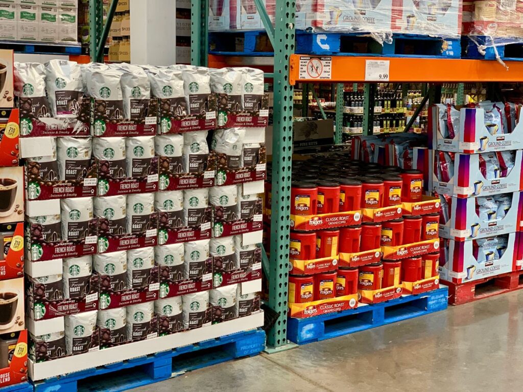
You have a large selection of their Kirkland’s brands, usually a couple Starbucks varieties, Dunkin’ coffee, Folgers, some local varieties (we have The Roasterie here in KC – which is pretty awesome); and throughout the year, you’ll see a rotation of other regional or niche brands such as Cameron’s or Peet’s.
For the past several trips, I’d been picking up Cameron’s Costa Rica blend; but it seemed they weren’t carrying it any longer. I went up and down the aisle a couple times making sure I didn’t just miss it – no luck, they didn’t have it.
There’s only like a thousand different coffees to choose from… now what?
I stood there in the aisle looking back and forth literally thinking “this reminds me of that jam selection research from the early 2000s by Iyengar and Lepper.” When Choice is Demotivating: Can One Desire Too Much of a Good Thing? – Journal of Personality and Social Psychology
If you’re not familiar with this research, their title (interestingly enough) sums up their findings pretty well – that is, more variety isn’t necessarily a good thing. And in their paper, the authors actually saw where too much choice had negative impact on sales.
So there I was, looking at dozens of varieties of Jams, err umm Coffee, and contemplating my pending selection.
Over the years, I’ve probably purchased most of the different coffee brands and roasts from Costco. For some reason, I felt like doing something different this time.
They had a new dark and bold Cuban coffee that I hadn’t tried before – that sounded interesting. Who doesn’t love a good Café Cubano? However, I’d probably be the only one in the house that would drink it.
There was a new Kona blend that I didn’t recall seeing before ~ “I think everyone likes Kona blend.” And then there was this new brand I’d never seen before…
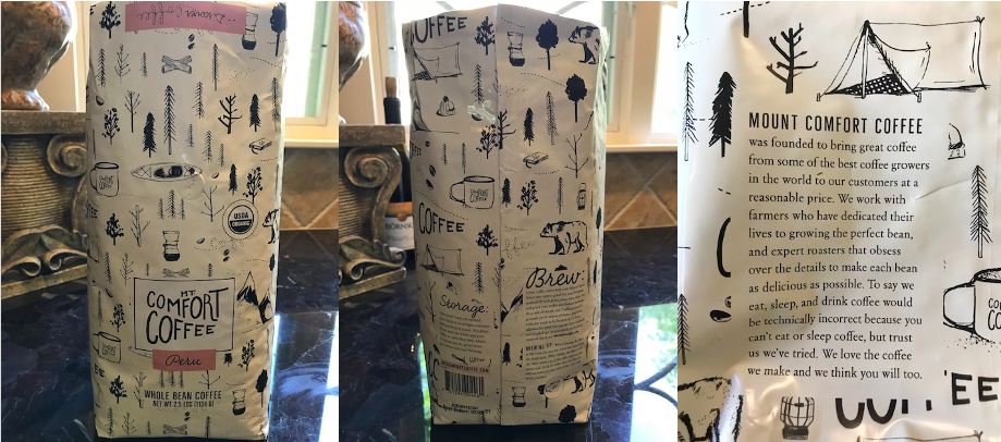
Its packaging was interesting. Unique. Stylistically whimsical hand drawn sketches of mountain / camping scenes and images. Mt Comfort Coffee organic beans from Peru – Medium Roast. The copy on the packaging was light-hearted, but had a reverent nod towards being serious when it came to the details around brewing.
Alright, these guys seem cool, let’s give this one a shot.
Let me just say, Mt. Comfort Coffee did not disappoint! It reminded me of the brew from this awesome little coffee bar (Methodical Coffee) in Greenville, SC. It’s amazing how smells and tastes trigger memories like that!
YAY! Let’s hear it for making a great book (coffee) selection based on the cover (packaging) – whew!
Since you can neither taste nor smell this awesome coffee, let me get back to Mt. Comfort Coffee’s packaging design…
There is a reason companies big and small sweat this detail. Design matters! Always has!
Their packaging was THE thing that got me to select them over the dozens of other options available at Costco that day. It spoke to me somehow. It drew me in. Great design does that! It often makes the difference between getting purchased or not.
In my mind, Mt. Comfort Coffee’s packaging design said something about their brand and their personality. I’m guessing the founders and people who work there are interesting, thoughtful, and they probably take what they do seriously – but maybe not themselves so much. I can identify with those kinds of people.
And they love what they do! – “We love the coffee we make and we hope you will too.” Gotta love that!
After only one pot, I can say I really like their coffee; perhaps on my way to love. We’ll know more tomorrow morning…
But here’s the thing, if their coffee was just average or worse, I don’t care how cool their packaging is, I wouldn’t go out of my way to buy it again. And this is something all great brands know…
What’s on the outside matters – a lot! But what’s on the inside matters even more!
Leave a Reply